The Art of Branding Beverages

Two years before Colectivo unveiled their new logo and identity, visions of sugar skulls were cavorting in the cranium of their resident artist. Down the road at Lakefront Brewery, new label designs for seasonal brews and a new one-off series called “My Turn” for employee-designed beers were fermenting alongside their award-winning craft brews. Just a year ago, fresh off the acquisition of Juiced! Michael Bortolotti sought to blend local artist Reginald Baylor’s original art into their centrifuge of package redesign.
All three beverage outfits are local examples of the trend to embrace and employ art in their branding. There are both pros and pitfalls to this practice of involved design. It can be hip and edgy; or it can be expensive and a constant chase for the next trend; at worst, it might be confusing for clients and customers if the art is disparate or incongruent with the brand. Either way, it falls on the risky side of the ledger if constant back-to-the-drawing-board moves are required. Beverage companies who believe in employing art, however, tend to be more innovative, subscribing to the notion their consumers are both the power behind and drivers of their brands.
The evolution of the art behind each of these companies is as different as the beverages themselves, but their efforts stem from a desire to paint a clearer picture of who they are and whom they serve.
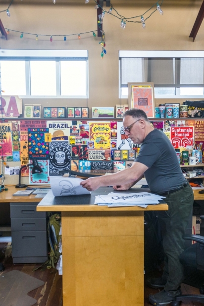
Colectivo Coffee’s sugar skull story begins with Kevin Callahan, who leased space in Walker’s Point to the infamous fledgling coffee operations of brothers Ward and Lincoln Fowler. Years later, Callahan became their distribution associate, and then their full-time in-house creative. Since 1999, his art form has morphed from putting out designs in what he calls, “Sharpie art,” and using hand-drawn designs for his premium-item company called Pride of Milwaukee, to fully digitizing his designs for then Alterra and now Colectivo branded logos, client applications and merchandise art.
On the day in 2010 when the candy producer Mars Inc. bought Alterra, Callahan said, “It was whispered into my ear that a new brand was on the horizon.” Lincoln Fowler, Ward Fowler and Paul Miller (Callahan’s former partner) still owned all of the Wisconsin and Illinois stores and continued operations under the Alterra name. With this bean of insight, however, “The design wheels began turning quickly to ready the name change,” Callahan added. A year later, when Mars had chosen to go with Alterra’s star logo, things kicked into high gear and by July of 2013, the company launched a whole new Colectivo Coffee name and brand, fleshed out by the iconic sugar skull logo.
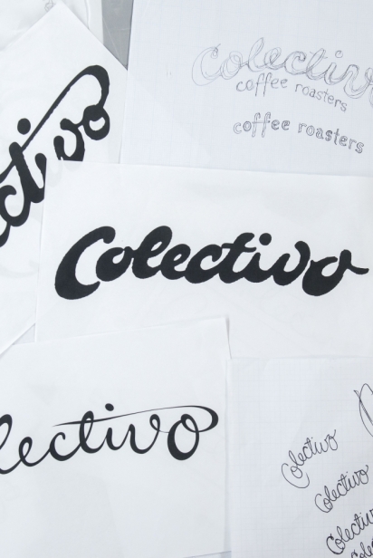
Scott Schwebel, Director of Marketing, coined the name, “Colectivo,” and handed it off to Callahan. “I didn’t want a ready-made font,” said Callahan, “I took pens and pencils and wrote the name like my own signature over and over again. As I wrote it out, I really liked the loops. I wanted to have a lot of ‘fat’ parts—a juicy logo, with weight to it. I didn’t want it to be cool or aloof. I wanted it to be in your face—very real and connective. It was important to me that the logo be legible, memorable—and looked like a coffee logo.”
The early logo iterations surrounding their Troubadour bakery brand evoked lushness, goodness and a mouth-watering color palate you could sink your teeth into. It was enveloped in “Egg yellows and caramel brown edges,” as Callahan explained it. The cornflower blue background of the skull logo played well with those luscious hues.
Callahan originally conjured the sugar skull to promote one of their longest standing relationships, the Mexican Collective Coffee group from Chiapas, Mexico. Sugar skulls originated in Mexico, where during Dia de los Muertos, or the Day of the Dead, Mexicans celebrate their deceased family and friends. However, because of the vibrant synchronicity of the colors, the celebration and its meaning, the skull morphed from just a coffee promotion to the brand icon itself.
While the skull wasn’t overwhelmingly embraced by some accounts at first, now it’s become so iconic that “The logo’d cup in someone’s hand across the room or street is instantly recognizable,” says Callahan. Investors have become comfortable with it, and sugar skulls— theirs and others—are everywhere, even Target. That mass acceptance and use, however, signaled to Callahan that it was time to make another, “Bold move,” as he said. In the summer of 2019, we will see new graphics in their 21 stores. “We think women especially will like this new design,” he believes. Appealing to women in order to succeed in the coffee and pastry business? Sugar skull or not, it’s a no-brainer.
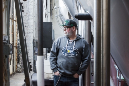
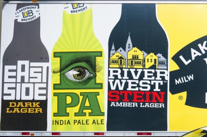
Lakefront Brewery’s romance with art and particularly local and regional artists, runs as deep in their veins as the beer in their tap lines. At Lakefront’s entrance, brewery-tanks-turned-sculptures of famed ‘Three Stooges’ Larry, Moe and Curly, welcome you with outstretched arms, emblematic of friendly shenanigans within. When they were the largest tanks that Lakefront owned in their original location, brewery president, Russ Klisch, engaged Riverwest artists to paint the trio’s portraits on the ends of the tanks as if the characters were trapped, pressed up against the tanks. In Klisch’s opinion, old brewing tanks never die—if they can morph into art.
Naturally, art most visibly intersects Lakefront’s brews on its bottles and cans. In their first years of production beginning in 1987, however, beer was sold only in barrels, so engraved brass plates were glued onto their tap handles. Two years later when they began to bottle Riverwest Stein and Klisch Pilsner, the labels were more deliberately executed.
“We wanted to convey two things,” said Klisch. “First, we were a local brewery—and by ‘local’ at that time—we meant the neighborhood. Secondly, we wanted to emphasize that the brewery was owned by just us. No big investors, no big money. Just two guys from the block.”
For brother Jim Klisch’s Riverwest Stein brew, the buildings on Clarke and Fratney Streets with Saint Casimir’s Church were used to symbolize the neighborhood. For his own Klisch Pilsner, Russ simply used their last name to signify the family ownership of the brand. A former high school classmate created the artwork, and both labels were well received in their neighborhood.
When distribution expanded to Milwaukee’s East Side, they decided to have a beer label and naming contest held at Dino’s Riverwest Restaurant next door. “We had brewed a smooth dark beer. The entry with the historic Water Tower graphic and the simple name of ‘East Side Dark’ won hands down,” said Klisch. Cream City Pale Ale followed shortly after, paying tribute to the Milwaukee’s nickname resulting from the unique cream colored brick.
The local theme of their label art carried through their next beers: the playful cow jumping over the pasture of their Organic ESB (Extra Special/Bitter), giving a nod to Wisconsin’s Dairyland. The Fuel Café Coffee Stout label toasted the partnership with its namesake café in Riverwest, whose house blend was used as a key ingredient in the beer. Acquainted through the Chicago Beer Society, Klisch engaged fellow brewing enthusiast and artist, Randy Mosher, to help formalize these designs and those of specific seasonal brews: Holiday Spice, Pumpkin Beer and Cherry Lager.
Mosher kept each label true to its brand of, “Locally-owned, small city brewery,” even as he was given artistic license to overlay his distinctively retro style. “We always had to convey the comfortable, accessible feel of our brewery and our brand,” said Klisch. “We avoided anything outlandish. And this continued to appeal to our customers.”
After Mosher left their operation, Lakefront engaged with many different local agencies before finally hiring an in-house a brand manager. Michael Stodola now creates all of Lakefront’s labels and has continued to portray the personality of the beer and hone the company image, while infusing a newness to some of the classic brews.
In his can redesign of Riverwest Stein, for example, Stodola, “Wanted to retain the image of Riverwest houses and enlarge the beer name to keep a strong connection to our original fans while developing new ones.” Jim Klisch suggested the Our Lady of Divine Providence church be featured as the, “Momma duck surrounded by her duckling row houses.” Stodola is now working through new labels as well as six-pack, 12-pack and variety-pack designs, introducing bolder graphics, color and strength. Stodola feels, “The Lakefront logo has become simpler, bolder and easier to read, and our labels now carry a stronger sense of community, of the leadership of the brand and of the brewery.” We’ll drink to that.
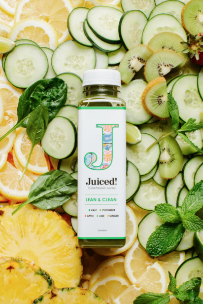
“Iconic, heroic and clean,” are the elements that local artist, Reginald Baylor, extracted from research to represent the brand label redesign for Juiced! beverages that Michael Bortolotti and his partners acquired a year ago. “Those values resonated with me, my own art and brand,” said Baylor.
Baylor “tweaked” some of his extensive art to match nine different juice varieties. Two of Bortolotti’s favorite labels are Eternal Life and Kay Dee Power, most exemplary of Baylor’s, “Clean use of colors and crisp artwork,” that would attract Juiced! consumers. Bortolotti describes his customers as moms and others who are health- and value-conscious, seeking the right-priced, attractive and tasty cold-pressed juices.
In logo development, Baylor winnowed through some 200 plus images of music, poster art, album covers, custom culture—even superheroes—and beverage icons like Absolut Vodka, which had always fascinated him. He narrowed down the logo to a simple ‘J’—reminiscent of Superman’s iconic ‘S’. Perhaps it’s a nod to the nutrient-supercharged qualities of its fresh cold-pressed juices!
Baylor appreciates that it takes a creative, collaborative team with courage to invoke original art for its branding. Bortolotti knows that attractive artwork in sync with brand values is a way to draw customers in, but in the end, it’s still the taste and goodness of the product that will win over and bring customers back.
Done well, label art can hone a brand and develop a loyal following among customers who respond to, identify with and perhaps even drive such iconography. A flawed product, however, can’t hide behind the canvas of great art. Level-headed Midwesterners and Milwaukeeans in particular, are savvy consumers. Attractive art on a brand’s product may draw a potential customer close enough to whisper sweet nothings, but the beverage inside the packaging must speak greater volumes, and deliver. It’s where good art and good taste converge.